If you can visualize it, you can do it. Professionals looking to master the art of project management and get things done without wasting time and money would be wise to keep this firmly in their mind.
Why Gantt charts and Power BI is a match made in heaven
March 15, 2023


It may sound like a cheesy inspirational quote, but it is actually sound advice rooted in a well-known psychological phenomenon called the Picture Superiority Effect. This refers to people’s tendencies to pay more attention to, and remembering visual stimuli way better than they remember written text.
Knowing how to use visual communication in project management can be a game-changer for keeping contributors and stakeholders informed and progress on track. This is what makes the combination of Gantt charts and Power BI very, very exciting.
Preserving project managers’ sanities since 1915.
When taking on projects that involve multiple teams, stakeholders and moving parts, the number of roadblocks and obstacles can quickly derail progress…unless you have tools that helps you stay on track.
Mr. Henry Gantt was probably not aware of the Picture Superiority Effect when he invented the Gantt charts somewhere between 1910-1015. But either way Gantt charts have enjoyed a long track-record of helping project managers preserve their sanity by providing a visual representation that makes it easier to organize and monitor timelines, milestones, and dependencies.
5 ways Power BI can make Gantt charts better than ever.
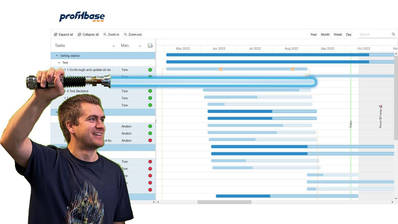
Businesses of all sizes, from tiny start-ups to huge corporations, use Power BI to easily create interactive and dynamic Gantt charts to allow all stakeholders monitor the status of projects and help make sure projects are completed on time and within budget.
Its simplicity and easy-to-use visualization that does not necessitate specific visual expertise, has made it a go-to solution for a variety of users.
Key benefits of using Power BI specifically for Gantt charts include:
- Easy data visualization: Power BI allows you to visualize your project data in a way that is easy to understand and interpret. The Gantt chart feature helps to display project timelines and tasks in a clear and concise manner.
- Updated project monitoring: With Power BI, you can create Gantt charts that update in multiple times a day, to get catch all changes in your project data. This means you can monitor project progress, supporting your decision making, ensuring that your project stays on track.
- Collaboration: Power BI allows you to share Gantt charts with other members of your team, facilitating collaboration and improving communication. This can help to ensure that everyone is on the same page and working towards the same goals. As all members might not have access to the planning system itself, but all can view relevant data through Power BI.
- Customization: Power BI offers a high level of customization, allowing you to tailor your Gantt charts to your specific needs. You can add labels, colors, and other elements to make your Gantt charts more informative, recognizable, and visually appealing.
- Integration: Power BI integrates with other Microsoft tools such as Excel, SharePoint, and Teams, making it easy to import data from many different sources, and export finalized reports to PDF and PowerPoint if needed.
Bonus tips: how to create an effective Gantt Chart
While creating a Gantt chart in Power BI is a straightforward process, there are some tips to keep in mind to ensure that your chart is effective and informative.
- Use Colors to Differentiate Tasks. Using different colors for each hierarchy level of the Gantt chart can help differentiate them and make the chart easier to navigate, as well as more visually appealing. Choose colors that are easy to distinguish from each other and match your company color scheme.
- Highlight Important Milestones. Adding a separate column in your data source for milestones and displaying them on the Gantt chart can help project managers and stakeholders understand the project’s progress and identify any potential issues.
- Add Task Dependencies. Displaying task dependencies on the Gantt chart can help project managers and stakeholders understand the order in which tasks need to be completed and identify any potential bottlenecks.
Conclusion
Creating Gantt charts with Power BI is a straightforward process that can help project managers to visualize and organize project timelines, activities, and dependencies.
By using Power BI’s interactive and dynamic features, project teams can monitor project progress, identify delays, and communicate project status to stakeholders.
If you’re looking for an easy-to-use visualization for project management, look no further than Profitbase Gantt visual for Power BI.


Subscribe to the Profitbase newsletter
Free quarterly email that delivers valuable information to business professionals